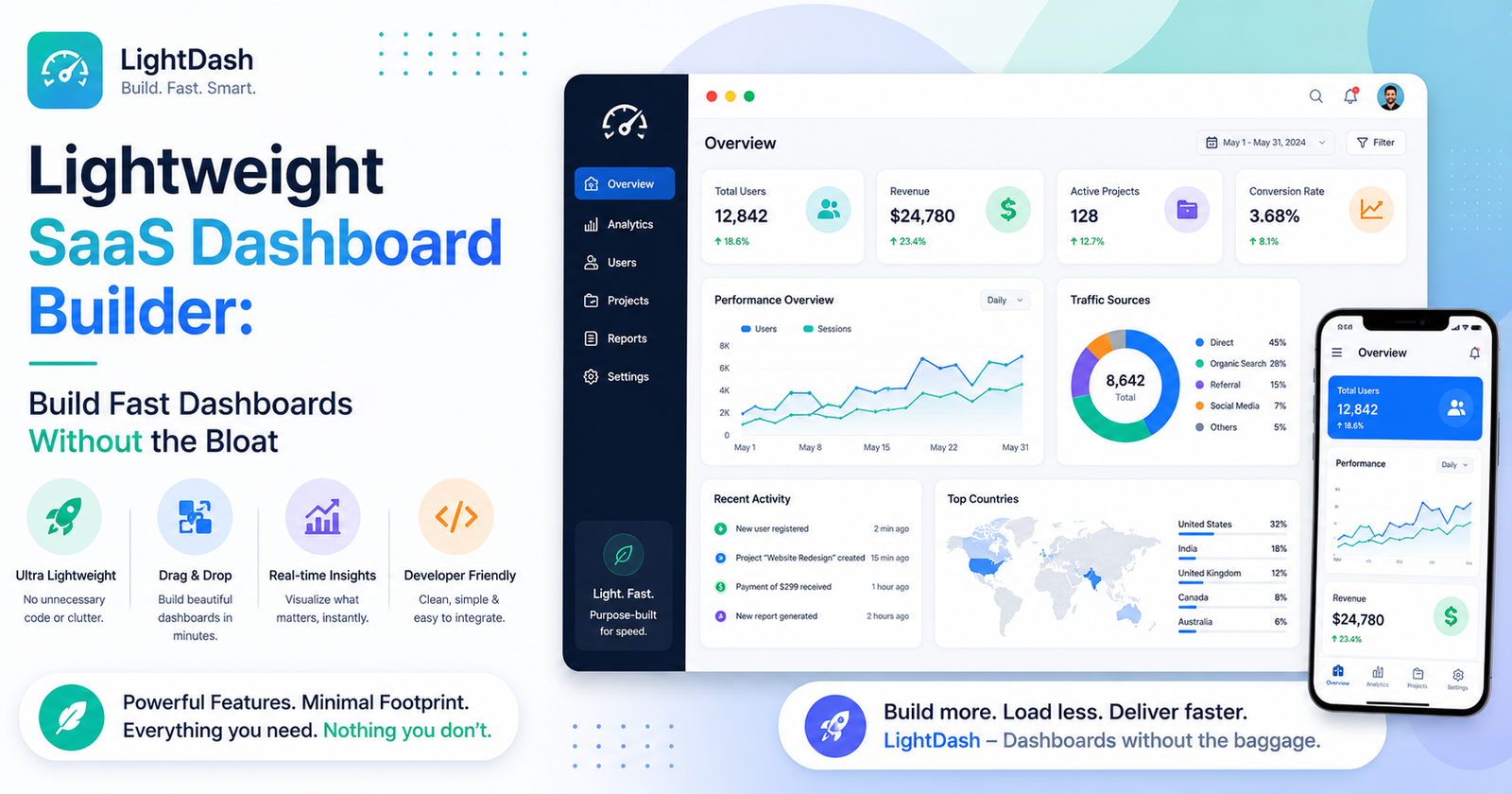

I once sat through a two-hour onboarding call just to learn how to build a dashboard that, in the end, showed three numbers. Three. Signups, revenue, churn. That’s it. The tool had something like two hundred chart types, a permissions system that needed its own documentation page, and a setup flow clearly designed by someone who’d never actually had to use it under a deadline. It worked, eventually, but it took a developer and half a day to get there. That’s the exact problem a lightweight SaaS dashboard builder is supposed to solve, and once you’ve lived through the bloated version, you start actively avoiding tools that brag about their feature count.
What “Lightweight” Should Actually Mean
Lightweight doesn’t mean stripped-down or limited, not really. It means the thing is built around speed and clarity first, instead of trying to be everything to everyone. A genuinely lightweight builder tends to give you:
- fast load times, even when you’re pulling live data from more than one source at once
- setup that a non-developer can actually finish without pinging an engineer
- enough chart types to cover the real use cases, without a dropdown menu nobody’s touched since launch
- defaults that look decent immediately, before you’ve customized a single thing
Why the Heavy Tools Slow Everyone Down
Bigger platforms usually come with a real learning curve attached. New hires need actual onboarding just to find where things live, and something that should take fifteen minutes stretches into an afternoon because the interface is crowded with options that maybe three companies on earth actually use. And all that extra weight tends to show up in performance too — slow loads, laggy filters, dashboards that start choking the moment you add a few too many widgets.
For small teams especially, none of that is a minor annoyance. It’s real time and real money spent wrestling with complexity that never gets used for anything.
Restraint Actually Wins Here
It’s tempting to assume more features automatically means more value. Dashboards are one of the rare places where that’s just wrong. A founder checking daily signups from their phone during a commute doesn’t need forty chart types — they need three numbers that load instantly and are easy to read one-handed. A lightweight tool respects that. A bloated one buries it.
What to Actually Look For
Time to your first working dashboard matters a lot, honestly — you should be looking at real data within minutes of connecting a source, not after an hour of documentation reading. Sensible defaults matter too: decent colors, readable fonts, chart types that make sense automatically instead of forcing you to configure everything from a blank slate. Setup overhead should stay minimal: no heavy backend work, no engineering ticket just to get something basic running. And it needs to stay fast as the data grows — plenty of tools look snappy in a demo with ten data points and then crawl the moment real volume shows up.
When Lightweight Isn’t the Right Call
To be fair, this isn’t the answer for everyone. A large enterprise juggling genuinely complex, multi-source reporting probably does need the depth that a heavier platform provides. The trick is matching the tool to the actual size of the problem you have, instead of defaulting to whatever has the longest feature list just because it exists and sounds impressive on a sales page.
Final Thoughts
A dashboard’s whole job is making information easier to act on, not harder to find inside a maze of settings. A lightweight SaaS dashboard builder keeps that front and center, trading unnecessary complexity for speed and a setup process that doesn’t burn a week of somebody’s time. For most small and mid-sized teams, that trade-off is exactly what makes people actually open the dashboard every day instead of once, then forgetting it exists.



[…] refers to the edge of the network. The point closest to where the data gets created in the first place, as opposed to some far-off cloud server. Edge AI […]
[…] flavors — direct-to-chip cooling, where coolant plates sit right on top of the processors, and immersion cooling, where entire servers just get submerged in a non-conductive […]
[…] tracking phone use has found a genuinely significant portion of checks happen with no real conscious decision preceding them at all. Closer to a reflex. Similar […]